My practice explores sumi-e as a contemporary language of simplicity, presence, and depth. Every mark is irreversible; this constraint creates a delicate balance between control and surrender.................
It becomes a reflection of my emotions, my sensitivity, and my lived experiences: a deeply personal expression that, paradoxically, can resonate with something universal...
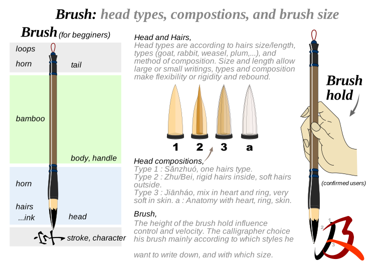
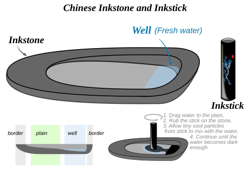
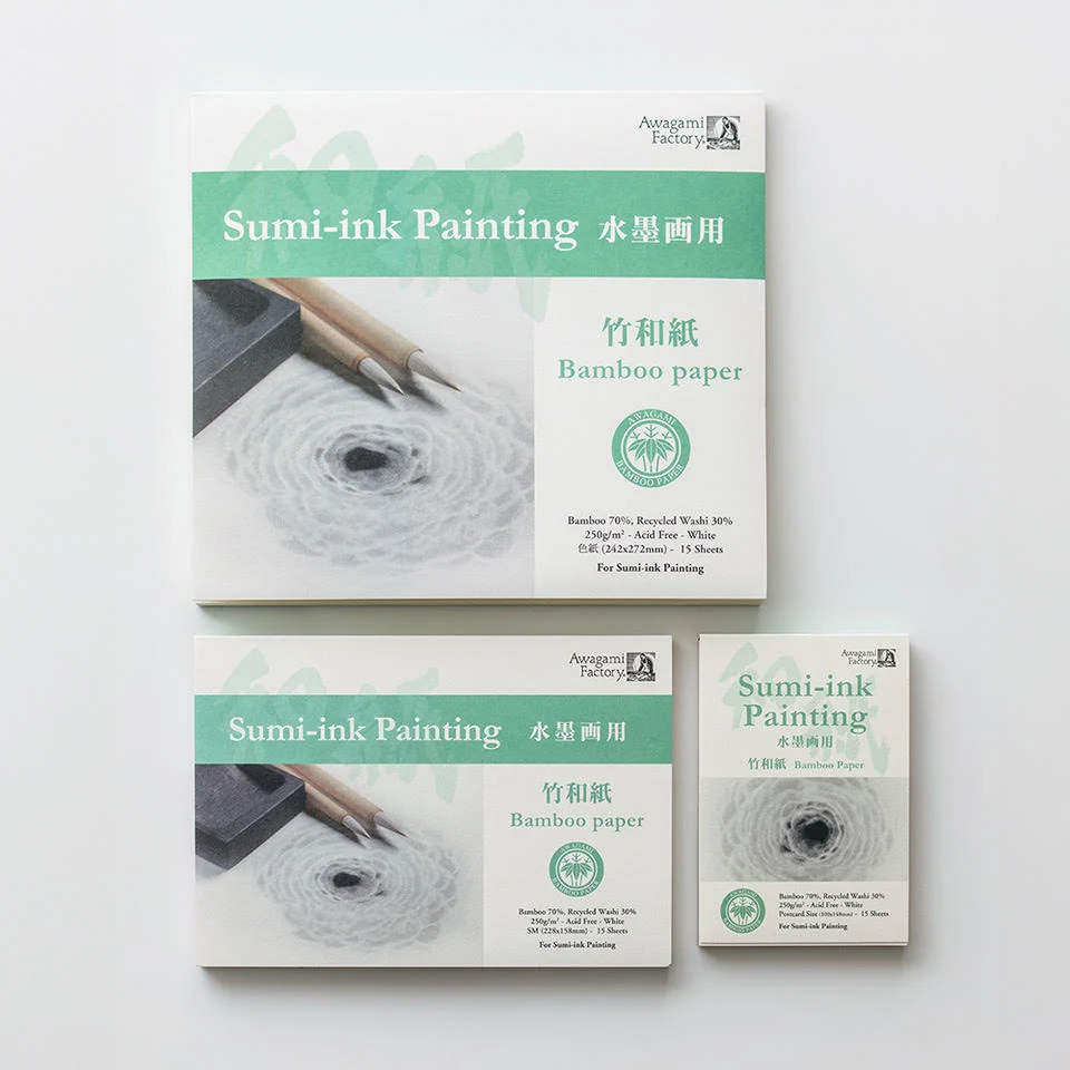
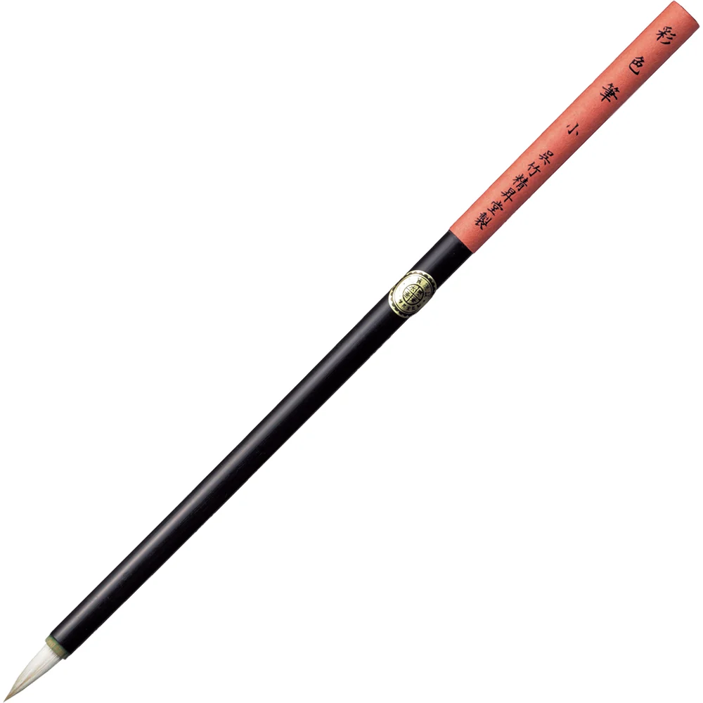
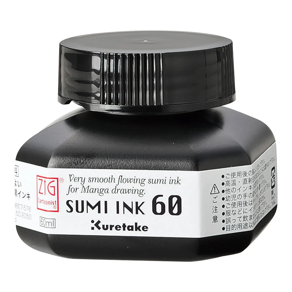
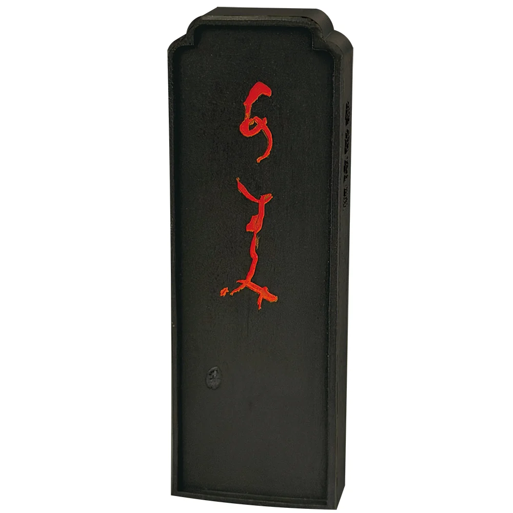
My work begins with a period of observation and silence. Rather than faithfully reproducing a subject, I try to grasp its energy, rhythm, and lingering sensation. Before touching the paper, I prepare the ink, observe the breathing of the brush, and imagine the space that must remain empty.
My current research introduces pigments as a counterpoint to black ink. The colour is not intended to decorate the image; it acts as a poetic presence, a depth or glimmer that redirects the eye. Each work thus becomes an encounter between Japanese tradition, personal experience, and the freedom of the present.
Natural motifs — a branch, flower, fruit, bamboo, or landscape — become inner states. The Four Gentlemen offer me an ancient vocabulary of flexibility, perseverance, renewal, and reserve. I approach them with respect without allowing them to become fixed, so that every composition remains personal and contemporary.
I alternate dense ink with transparent washes, quick gestures with pauses. The paper’s accidents, the diffusion of water, and irregularities in the line are not flaws to be erased: they bear witness to the moment in which the work took form and contribute to its living character.
I started painting to find balance, to relax, and to create a space where I could reconnect with a sense of calm. More specifically, this style of painting — ink, black and white, with subtle touches of color within a minimalist composition — has a soothing effect on me and allows me to slow down.
The rest is noise. Let us pause for a moment and immerse ourselves in this world. Leave everything else behind and bring your attention back to yourself and to what truly matters.
Let us stop living through the lives of others and take the time to reconnect with our own needs and our own rhythm.
Whenever I feel overwhelmed by events, stress, or cognitive overload, I take a step back. And when I cannot sit down and paint, I find in my paintings a path back to stillness and focus.
This is exactly what I hope to convey through my creations: a moment of pause, almost meditative, where you can lose yourself in shades of grey and black, punctuated by energetic brushstrokes.
Softness to slow down and find calm.
Energy to move forward.
And perhaps, to find your way back to the path that is truly your own.